
角落落地燈65 吋變色 LED 落地燈,帶音樂同步,現代情調照明角落燈,帶遙控器和
$488
商品詳情
即刻購買——!
2件任意貨品可免70元港幣!
!
7天無理由退款退貨!
本商品適用於“收到商品7天内,可無理由退貨退款”
可安心購買,更無需擔憂售後及保養問題
東九龍倉庫網站https://shophoho.com
客服WhatsApp:9444 2816
NO
光通量:60-249
是No包含燈泡:不
起源:美國(原產地)
電源:交流
Brand Name:KIQUNE
完成類型
繪
基材
鐵
產品尺寸
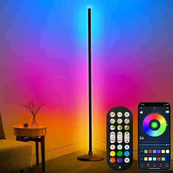
16 英吋深 x 16 英吋寬 x 65 英吋高
商品重量
1.89 公斤
燈泡類型
落地燈
關於此產品
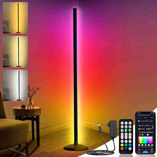
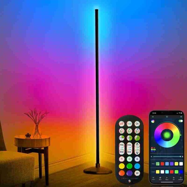
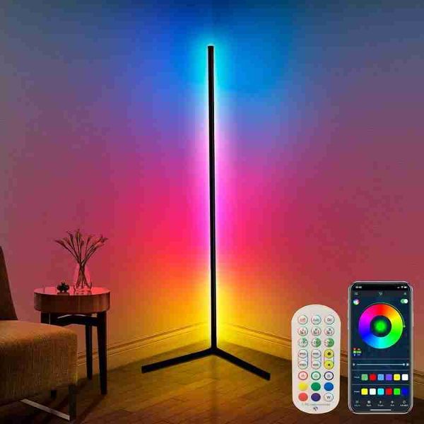
動態誘人的燈光效果:變色落地燈創造出 1600 萬種顏色和 300 多種動態場景模式,您可以根據自己的心情、場合或活動自訂您的生活空間。我們的 LED 落地燈的動畫多色效果可以裝飾您的臥室、客廳、遊戲室、宿舍或辦公室。現代氛圍適合舉辦遊戲之夜、派對、看電影或閱讀放鬆。無論您有何需求,都可以沉浸在真實奇妙的燈光體驗中。
高度可調的 RGB 落地燈:角落落地燈高度為 65 英寸,是市場上最高的落地燈,這款落地燈設計有 4 段可拆卸燈拼接,即插即用。底座採用優質鐵製成,無需安裝,節省空間並使其更加穩定。
智慧型應用程式和遙控器:LED 角落落地燈不僅可以透過遙控器(使用前請移除塑膠薄膜)和控制盒控制,還可以透過藍牙連接透過應用程式控制。您可以透過應用程式選擇您喜歡的顏色、照明模式、音樂、亮度甚至照明速度。循環靜態顏色或動態變色場景 - 享受多種動態場景,例如歡快、浪漫或 DIY 您最喜歡的照明模式。
音樂現代智慧角燈:這款客廳 LED 角燈配備高靈敏度麥克風,當角落落地燈處於音樂模式時,燈光將與音樂節奏同步,營造出浪漫快樂的氛圍。此外,當打開麥克風模式時,角落燈可以隨著手機麥克風和外部麥克風的音樂或旋律而脈動,讓您的客廳、臥室、遊戲室更加精彩。
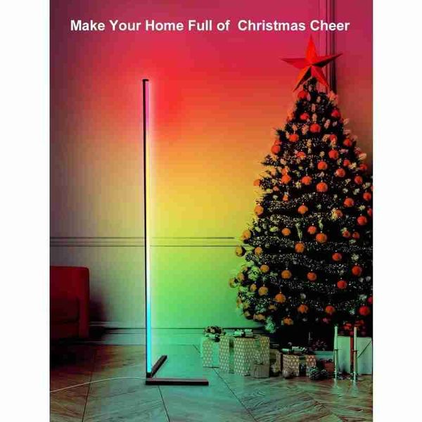
護眼落地燈:具有定時功能,情緒照明角燈可以在設定的時間自動開啟或關閉。預設您喜歡的模式和亮度,定時後,RGB角燈會在早晨以柔和的燈光逐漸喚醒您,在黑夜裡陪您入睡,並為您提供安全感。萬聖節和聖誕節即將到來!還在尋找要買什麼給特別的人嗎?這款落地燈是絕佳的選擇。
.aplus-v2 .aplus-review-right-padding {
padding-right: 0.1rem;
}
.aplus-v2 .aplus-review-right-padding {
padding-right: 0.1rem;
}
.aplus-v2 .aplus-review-right-padding {
padding-right: 0.1rem;
}
.aplus-v2 .aplus-review-right-padding {
padding-right: 0.1rem;
}
.aplus-v2 .aplus-review-right-padding {
padding-right: 0.1rem;
}
.aplus-v2 .apm-brand-story-carousel-container {
position: relative;
}
.aplus-v2 .apm-brand-story-carousel-hero-container,
.aplus-v2 .apm-brand-story-carousel-hero-container > div {
position: absolute;
width: 100%;
}
/*
Ensuring the carousel takes only the space it needs.
The sizes need to be set again on the absolutely positioned elements so they can take up space.
*/
.aplus-v2 .apm-brand-story-carousel-container,
.aplus-v2 .apm-brand-story-carousel-hero-container {
height: 625px;
width: 100%;
max-width: 1464px;
margin-left: auto;
margin-right: auto;
overflow: hidden;
}
.aplus-v2 .apm-brand-story-carousel-hero-container,
.aplus-v2 .apm-brand-story-carousel-hero-container > div {
height: 625px;
}
.aplus-v2 .apm-brand-story-carousel.a-carousel-container {
padding: 0px;
}
/*
This centers the carousel vertically on top of the hero image container and after the logo area (125px).
Margin-top = (heroHeight - cardHeight - logoAreaHeight) / 2 + logoAreaHeight
*/
.aplus-v2 .apm-brand-story-carousel .a-carousel-row-inner {
margin-top: 149px;
}
/*
Cards need to have a width set, otherwise they default to 50px or so.
All cards must have the same width. The carousel will resize itself so all cards take the width of the largest card.
The left margin is for leaving a space between each card.
*/
.aplus-v2 .apm-brand-story-carousel .a-carousel-card {
width: 362px;
margin-left: 30px !important;
}
/* styling the navigation buttons so they are taller, flush with the sides, and have a clean white background */
.aplus-v2 .apm-brand-story-carousel .a-carousel-col.a-carousel-left,
.aplus-v2 .apm-brand-story-carousel .a-carousel-col.a-carousel-right {
padding: 0px;
}
.aplus-v2 .apm-brand-story-carousel .a-carousel-col.a-carousel-left .a-button-image,
.aplus-v2 .apm-brand-story-carousel .a-carousel-col.a-carousel-right .a-button-image {
border: none;
margin: 0px;
}
.aplus-v2 .apm-brand-story-carousel .a-carousel-col.a-carousel-left .a-button-image .a-button-inner,
.aplus-v2 .apm-brand-story-carousel .a-carousel-col.a-carousel-right .a-button-image .a-button-inner {
background: #fff;
padding: 20px 6px;
}
.aplus-v2 .apm-brand-story-carousel .a-carousel-col.a-carousel-left .a-button-image .a-button-inner {
border-radius: 0px 4px 4px 0px;
}
.aplus-v2 .apm-brand-story-carousel .a-carousel-col.a-carousel-right .a-button-image .a-button-inner {
border-radius: 4px 0px 0px 4px;
}
送貨詳情
付款方式


角落落地燈65 吋變色 LED 落地燈,帶音樂同步,現代情調照明角落燈,帶遙控器和
$488
數量
同店推薦
關於我們
如何購買
條款細則
聯絡我們
HOHO MALL / HOHO商城(香港九龍東倉庫網站平臺)
WhatsApp: 9444 2816
聯絡電郵:batishgarth@gmail.com
週一至週六: 09:00-22:00
星期天: 09:00-20:00
公眾假期: 休息